The number one fastest, easiest, and least expensive way to dramatically change the look and feel of any room in your home is to repaint. A new color can transform your space without any other changes, and can even improve your mood. In fact, the most recent color trends are all about promoting relaxation, connecting with nature, and generally helping you unwind. If you’re considering a project, here are a few of the latest trends to help inspire you to paint!
Natural Neutrals
Taupe Living Room Design (by Michael Abrams Limited)Perhaps the biggest movement in paint color trends is the movement away from vibrant, intense wall colors to softer colors, including the resurgence of pastels. Most popular are neutral tones in the beige family, though probably a little darker than you might be thinking. Much to my delight deep beiges, taupes, dark mustardy browns, and even rich chocolate colors are all becoming quite popular, offering more lively possibilities while remaining in the neutral family.
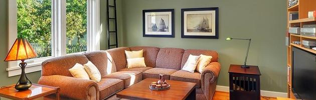
Sage Greens
Sage Living Room (by Seattle Staged To Sell)Greens of all shades are definitely trending, from Pantone’s intense Emerald to pastel mints, but sage green is easily one of the most popular. This muted green is a breath of fresh air in a natural neutral palette, a great way to get a fresh, natural look that doesn’t draw attention to itself. Sage greens pair perfectly with a wide range of neutrals, from canvas white to deep chocolate browns and even earthy reds, but do so while evoking lush plant life, which is great for creating a relaxed, natural decor. This is the perfect color for a green home, and a good way to add inoffensive personality if you’re looking to resell.
Minty Greens
Fresh Mint Green Walls (by Mark English Architects AIA)The abundance of greens in interior design right now has everything to do with the mood-enhancing power of colors. If 2012 was all about bright, energetic oranges, current paint color trends are more relaxed, focusing on colors meant to inspire serenity, tranquility, harmony, and well being. Because of the color’s close association with nature, all shades of green are naturally relaxing and rejuvenating, and with so many different shades, it’s easy to find one to suit your personal mood. Mint greens are also quite popular right now, but have a fresh, springy feel that’s very different from laid back sages and assertive royal emerald tones.
Baby Blues
Pastel Blues (by KannCept Design Inc)Blue has long been a popular wall color, again in no small part because of its impact on your mood. Science has shown that simply being in a blue room can help increase feelings of calm and decrease anxiety; it can even help lower your blood pressure. But while pastels are making a comeback, blues are trending in a few different directions. Toward the pastel end of the spectrum are blues with a slight gray or silvery tint. These have a more muted appearance than your average baby blue, and mesh better with a light neutral decor for a relaxed, seaside vibe.
Bold Blues
Dark Teal Divider Wall (by David Weekley Homes)On the way, way opposite end of the paint color trend spectrum are bold aquas, peacock blues, turquoise, and teal. Along with hot pink and purple, these nearly-neon colors have showed surprising staying power, especially in an urban chic decor. Used in high contrast with black or white (this room has the contrast, though the teal is a little on the dark side for this style), these colors are vibrant and lovely (if not particularly soothing). This color scheme is an excellent choice if you want a look that’s both cheery and a little daring.
Go Navy
Navy Hamptons Style Study (by Garrison Hullinger Interior Design Inc)Finally, maybe the most popular blue paint color trend is blues that are very, very dark. Deep navy blues and inky indigo purples are assertive colors that are a much more conservative choice than peacock blues, but with a similar vivid impact. The darkest navy blues are just a few shades north of black, making this a paint color trend that might not be for the faint of heart. That said, pairing a dark color like this with lots (and lots) of white – especially with white crown and base molding, as well as white curtains and white accent furniture – makes it seem lighter by contrast. This is a great way to add unexpected color to a historical home while still maintaining a relatively traditional look, and it also makes for a really lovely nautical-type room.
Getting Gray?
Slate Gray Living Room (by Ann Lowengart Interiors LLC)Right up there with the wide array of neutral tones that make up the latest paint color trends is one that might surprise you: gray. From light, almost silvery grays to assertive iron and slate colors, gray is in in a big way. Most commonly, various layered shades of gray are used in modern design to create a monochromatic contrast. But don’t let this rather cool, industrial use fool you: gray can be great in a more traditional space as well. In the room above, I love the way the white crown molding makes the dark, dark gray pop, and the bright green accents and sassy modern pendant light give a lively, springy feel to the otherwise rather formal backdrop.
Mellow Yellow
Sunny Yellow Living Room (by David Neiman Architects)In a sharp contrast to all these rather subdued, more-or-less-neutral colors is the recent surge in popularity of yellow. This is perhaps my favorite color trend, as I’d be more than content to live in a house painted yellow inside and out. While the sunny, vibrant color might seem at odds with, for example, a more ponderous sage, its popularity makes sense when you look at it in terms of mood. Yellow is a warm, inviting, uplifting color, and paler tones have the same relaxing, natural, summery sunshine feel you’d get from a green paint. While greens offer a mellow sense of nature, even pale yellows have a natural feel, but with a little more warmth and energy.
Bold Earth Tones
Russet Red Livingroom Walls (by Robert Kocis)While the lion’s share of paint color trends are tending toward soft neutrals, if you’re a fan of bold colors, you aren’t entirely out of luck. In fact, aside from wild turquoise colors, more nature-inspired bold colors are becoming quite popular. Clay reds and rusty oranges have especially shown a lot of staying power over the last few years. With a slightly southwestern flair, this red-rock color is great for adding vibrant warmth to a living space, but is a natural enough tone to blend well with an otherwise neutral beigey decor.
What do you think? What are your favorite paint color trends this year? Let me know in the comments!