Adding a tile backsplash is one of the easiest and most affordable ways to dramatically update the look and feel of your kitchen. It’s a simple but striking alteration, and can really help set the mood for the whole space. Installing a backsplash is also a great way to add color to your kitchen, but what color you choose matters. For every color of the rainbow, there are tints that are especially popular, and some colors and types of tile work better in some kitchens than others.

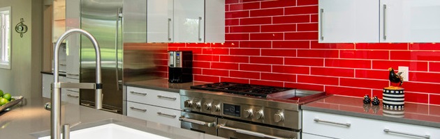
When you think of kitchen backsplashes designed to really make a statement, fire engine red is almost always the way to go. These can be made anywhere from 1 inch square tiles all the way up to big, painted glass sheets, but are designed to make the whole kitchen – especially a white kitchen – pop. Now, you can find red tile that skews to darker wine tones or even brown or orangey brick colors, but to get the most wow factor, opt for a pure, primary red set against either white counter tops or white cabinets. The glossier the tile (and the cabinets) the more modern the look and more stark and attention grabbing the contrast.
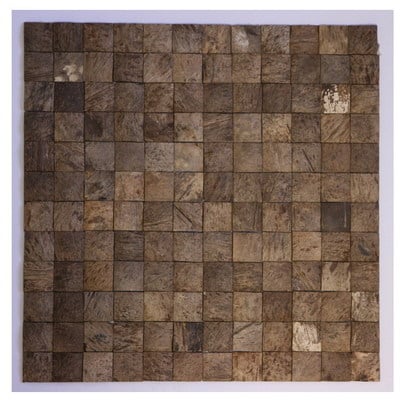
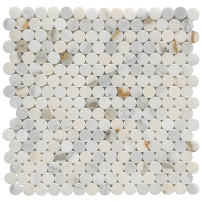
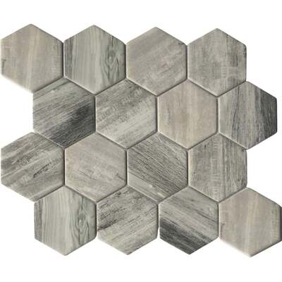
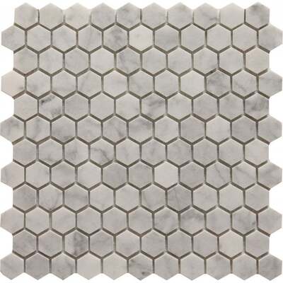
Shop Mosaic Tile by Martini Mosaic:

Bright, bold oranges have become something of a niche statement piece, especially in modern or professional style kitchens. Orange backsplashes have the same assertiveness that red ones do, but are a little softer and warmer feeling. Especially rich, pumpkiny oranges can be quite inviting, making for a less stark modern look. It can be a little hard to find truly orange tile in anything other than large painted glass sheets, which can be a little too bold for a very traditional kitchen. That said, this look works great in a modern, professional style kitchen – especially paired with an Italian kitchen range done in the same color!
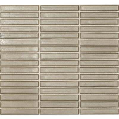
Shop Mosaic Tile by Altoglass:

Yellow is a sort of funny color for a kitchen backsplash, because unless you go for primary or neon yellow (which is very rare, even in a highly modern kitchen), it isn’t a very assertive color. You’re more likely to see sandy yellows just a shade from off white, which add a fresher, sunnier aspect than conventional ceramic, but still fit within that soft, neutral range that isn’t too wild. Darker ochers or mustard yellows have more personality, but veering too close to green or brown can make a backsplash look a little sickly. Lighter tiles with darker coloring or edges work a little bitter, but as with yellow paint, yellow tile looks great when it’s done just right, but is really easy to get wrong. For the best results, test out sample tile sheets in your kitchen with different levels of light to make sure you get a color that looks sunny rather than dingy.
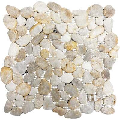
Shop Mosaic Tile by Tesoro:

Green is a color that’s become a lot more popular lately, sort of ironically in step with the green home movement. As homeowners are opting for lighter, more renewable materials in the kitchen like bamboo, there’s a trend toward creating earthier looking kitchens, and that means paring wood with soft, sagey, leafy greens. Maybe surprisingly, the use of green in tile backsplashes is almost entirely limited to these subdued pastel greens, often in glass tile, which add a little bit of color to a clean, white kitchen, and again that natural element to a kitchen with a lot of light wood. The one exception is the popularity of screaming lime green in an ultra modern kitchen, which is usually paired with glossy white cabinets.
Shop Mosaic Tile by Soci:

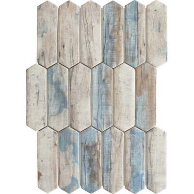


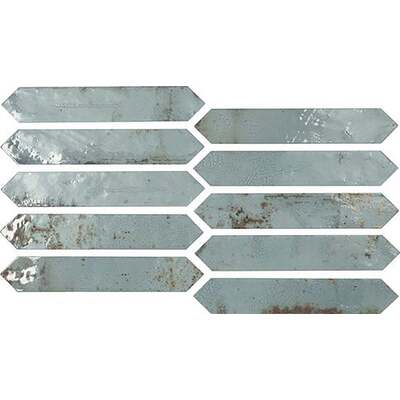
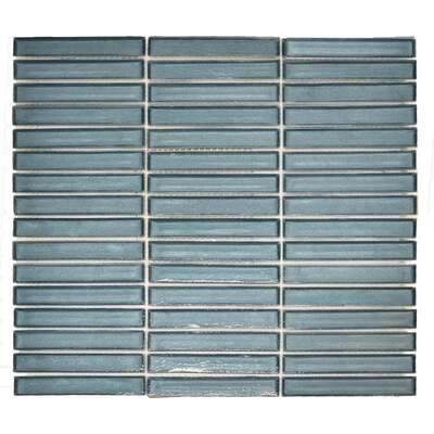

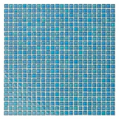
Blue tile backsplashes are easily the most diverse in terms of tint, tone, and shade. While most other colors usually stick more or less to a few popular varieties, blue backsplashes come in every stripe, from icy baby blues to near-black navy, true-blue primary blues to assertive aquas and teals, and everywhere in between. Blue is also one of the most popular colors on this list, as it adds an open, airy feel to the kitchen, and has a pleasant calming effect. Thin glass rectangular tiles and classic subway sized-and-shaped tiles are particularly popular, and this is one of the few colors where one inch square tiles are still popular, too. As a rule of thumb, save darker shades for very traditional kitchens, and pair greener blues with natural wood tones for an earthier look.

Purple is probably the most difficult color to use for a backsplash. Red is the traditional “look at me” color, but because it’s a primary, it’s actually a little bit easier to coordinate with the surrounding decor. Green and orange, with are both also secondary colors, have a slightly more natural, earthier feel, which makes them pair well with neutral shades. But purple is a bold, assertive color that doesn’t really pair with anything but more purple. In other words, you have to really like purple to commit to a permanent fixture like a backsplash. That said, if you do, don’t go half way – opt for full on eggplant purple tile or painted glass and use it as the focal point of your kitchen. A light, lavender tinted gray stone tile will offer a subtler look for a more traditional kitchen, but a deep, bright purple will really wow, especially in a modern space.
But what color do you like the most? Do you like the bold, assertive look of red, or prefer the more muted, natural look of a minty green? Let me know in the comments!
Shop All Mosaic Tile: