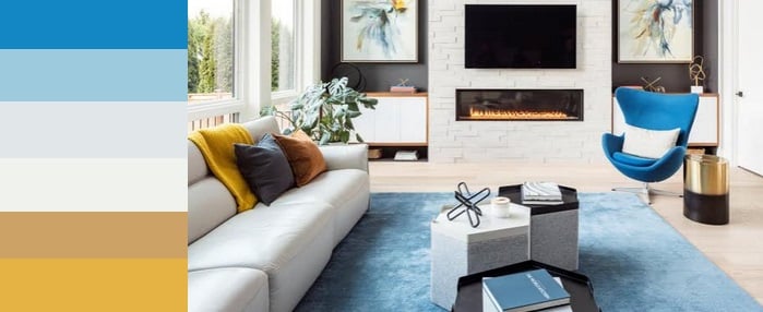
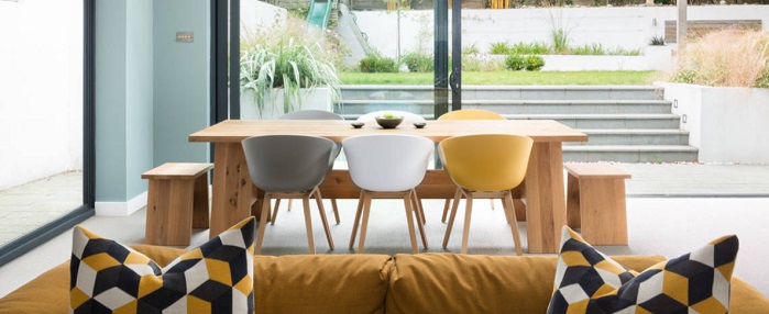
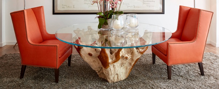
Decorating with neutral base elements makes it simple to add color to you decor with easy-to-swap accent pieces. But often examples of this are pretty in-your-face; they highlight a single color in a very intense way that might not be the look you’re going for. So today, I want to take a look at this […]
Bedroom Ideas, Decorating Ideas and Tips, Dining Room Furniture and Decor, Furnishing Ideas, Latest Trends
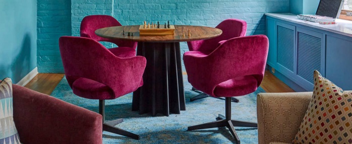
Viva Magenta! 2023 Pantone’s Color of the Year
28
Feb
Feb
With the turn from 2022 to 2023, many interior designers wait in anticipation for word from Pantone. Pantone’s Color of the Year is always a hot topic, and 2023’s capitalizes on that buzz with its vividity. The Color of the Year is Viva Magenta 18-1750, a startling, in-your-face pink that punches through the multiverse not […]
Bathroom, Bedroom Ideas, Decorating Ideas and Tips, Flooring, Furnishing Ideas, Latest Trends, Outdoor Living
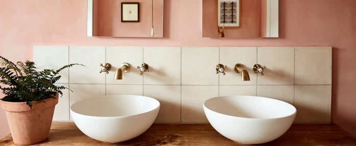
Sherwin-Williams 2023 Color of The Year Is Redend Point
22
Feb
Feb
As we really roll into the new year, every big paint company releases their trendy color of the year, and 2023 is no different. For Sherwin-Williams, this year’s big color is Redend Point (SW 9081) a creamy, rose-tinted brown. A more saturated blend of two colors that have been popular in recent years – beige […]
Decorating Ideas and Tips, Furnishing Ideas, Latest Trends
Introducing Pantone’s Color of the Year for 2022: Very Peri
28
Mar
Mar
My breakdown of Pantone’s color of the year pick for 2022 is coming to you a little late this year for one simple reason: I’m not a huge fan of Periwinkle. I lived in a house painted almost the exact same shade as Pantone’s Very Peri for years, and know all its pitfalls; it turns […]
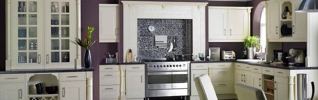
Bedroom Ideas, Decorating Ideas and Tips, Dining Room Furniture and Decor, Furnishing Ideas, Kitchen, Kitchen Cabinets & Furniture, Latest Trends
Introducing Pantone’s Color of the Year for 2021: Ultimate Gray…And Illuminating
22
Feb
Feb
Pantone’s color of the year picks are always a little symbolic. Usually, it’s a color that feels significant – one that will influence the design and fashion industries, and often has subtle political undercurrents. But it’s also always at least one part attempt at a mood ring for the population of the planet. Pantone leans […]
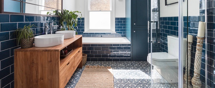
Bathroom, Decorating Ideas and Tips, Furnishing Ideas, Kitchen, Latest Trends
Introducing Pantone’s Color of the Year for 2020: Classic Blue
01
Feb
Feb
Pantone’s color of the year for 2020 is a classic comeback story, literally: it’s Classic Blue! Classic Blue is an almost-but-not-quite primary blue that you might have noticed regaining popularity in late 2019; the same blue that’s touted as having a calming effect on the mind. And that’s exactly the reason Pantone cites for choosing […]
Decorating Ideas and Tips, Furnishing Ideas, Latest Trends, Outdoor Living
Introducing Pantone’s Color of the Year for 2019: Living Coral
21
Mar
Mar
Pantone’s color of the year for 2019 is Living Coral, and it’s the perfect color to help decorate your home for spring. Why “Living Coral”? According to Pantone themselves, it’s because the color is both cheerful and comforting, a warm tone to help inject a little optimism into our daily lives. It’s also a color […]
Decorating Ideas and Tips, Latest Trends
Introducing Pantone’s Color of the Year for 2018: Ultra Violet
21
Dec
Dec
It seems like 2017 went by in a rush for just about everyone, but as the year draws to a close, it’s time to slow down and think about the year to come. Everyone from car companies to fashion designers are already rolling out new models and predictions for 2018, but one of my favorites (and […]
24
Nov
Nov
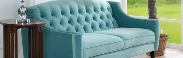
If you take a glance through design websites and catalogues this year, you are sure to notice the encroaching threat of the tide. Or the tide’s colors, at least. Light blues, sea greens, and turquoises are all immensely trendy colors this season, which I discovered shortly after beginning my investigation into velvet sofas. Almost all […]
Decorating Ideas and Tips, Latest Trends
Top Color Trends For 2015 – A Cheat Sheet To Popular Palettes
13
Feb
Feb
Color is an incredibly powerful tool when it comes to interior design, but choosing even a single color to paint the walls with can be stressful, let alone choosing and implementing a color scheme for the whole room. It’s easy to look at a paint chip or color wheel and find a color you like, […]
- 1
- 2